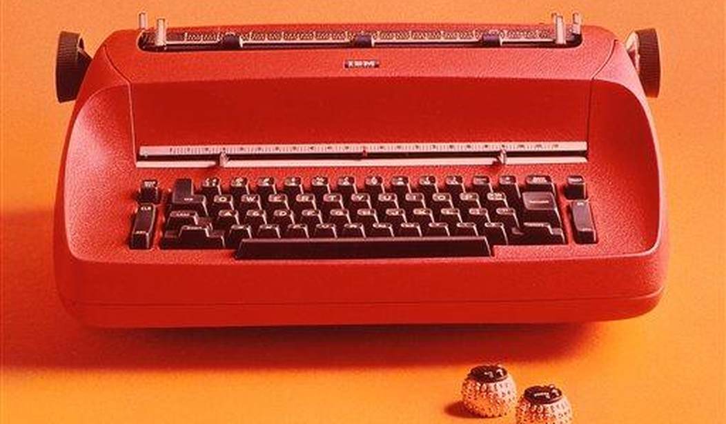
Which font you use might not seem like a big deal, but as with many things, appearances matter when it comes to communications. Secretary of State Marco Rubio thinks so too, and is nuking a Biden-era edict that the department use the Calibri font when it comes to official missives. He’s ordered a return to the more stately Times New Roman, a font that adds a more serious tone than the cutesy, modern-looking Calibri.
Former Biden Secretary of State Antony Blinken had demanded the use of Calibri for, you guessed it, diversity, equality, and inclusion (DEI) reasons. Rubio is only too happy to erase one more facet of their legacy:
Two years ago, Rubio’s predecessor, Antony Blinken, switched to Calibri, a softer, simpler-shaped, and wider font than Times New Roman, in part to assist individuals with certain visual disabilities such as low vision and dyslexia.
“Switching to Calibri achieved nothing except the degradation of the department’s official correspondence,” Rubio wrote in an “action request,” obtained by Reuters and the New York Times.
Secretary of State, Marco Rubio, has ordered… a font change.
— The Lunduke Journal (@LundukeJournal) December 10, 2025
The Calibri font was instituted, during the Biden administration, at the recommendation from the “Office of Diversity and Inclusion.”
Secretary Rubio has reverted back to Times New Roman, saying, “Switching to… pic.twitter.com/FDEhE5gleb
The above tweet continues:
Secretary Rubio has reverted back to Times New Roman, saying, “Switching to Calibri achieved nothing except the degradation of the department’s official correspondence.”
Rubio added that moving back to Times New Roman would “restore decorum and professionalism to the department’s written work.“
It’s not often you get top level government officials making passionate statements regarding fonts.
READ MORE: Lefties in Search of a Life: The Always Aggrieved Crowd Now Freaking Out Over... a Paint Color
'We Messed Up': Cracker Barrel CEO Answers Questions for the First Time Since Rebrand Disaster
Like Transportation Secretary Sean Duffy, Rubio believes that how something looks matters. He added that Blinken’s change was wasteful, and the department had not seen a drop in “accessibility-based document remediation cases.” But in the end, it was about professionalism:
“To restore decorum and professionalism to the Department’s written work products and abolish yet another wasteful DEIA [Diversity, Equity, Inclusion, and Accessibility] program, the Department is returning to Times New Roman as its standard typeface,” Rubio reportedly wrote.
“This formatting standard aligns with the President’s One Voice for America’s Foreign Relations directive, underscoring the Department’s responsibility to present a unified, professional voice in all communications.”
He also argued in his memo that Times New Roman is "generally perceived to connote tradition, formality and ceremony," and that Calibri is "informal" and "clashes" with the department’s official letterhead.
If we learned one thing since Trump took office, it's that there was no limit to how far the Biden WH would go to DEI-ify everything.
— Jane Coleman (@JaneBColeman) December 10, 2025
Even @StateDept's official Times New Roman font was canceled - replaced with the more "inclusive" Calibri.
Via @wajacobson in @LegInsurrection pic.twitter.com/h0Y8UGLD2R
It might not seem like that big a deal, but to paraphrase Neil Armstrong, one small step can signify something larger. In this case, it’s just a font, but it’s a symbol of returning the White House back into a serious place, not the race, gender, and "equity" obsessed playground that didn’t seem to be run by adults under Ole Joe.
Another part of their legacy has just gotten the Wite-Out treatment.
The Democrat Party has never been less popular as voters reject its globalist agenda.
Help us continue exposing Democrats' plans to lead America down a dangerous path. Join RedState VIP and use promo code FIGHT to get 60% off your membership.


Join the conversation as a VIP Member