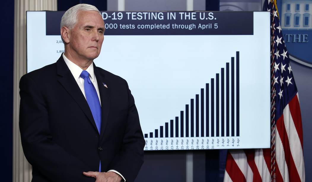
Vice President Mike Pence listens as President Donald Trump speaks about the coronavirus in the James Brady Press Briefing Room of the White House, Monday, April 6, 2020, in Washington. (AP Photo/Alex Brandon)
As I noted in my last two Wuhan virus nightly updates, the deeper I got into this, the more I realized I was in way over my head. I decided to recruit some folks who are not only way smarter than I am (admittedly a pretty low bar) but are also experienced in crunching numbers…and most importantly, are folks I trust. The three guys I recruited, do this kind of thing in their sleep.
The guy that did the grunt work on slides for this piece is an old friend and Academy classmate I’ll call, “Miguel.” If you were to do a casting call for an actual person who was actually, “The Most Interesting Man in the World,” it would be Miguel. He’s been there, done that, got the T-shirt, the coffee cup, AND the coin. He’s also a genius with numbers and figuring out what they mean. However, my adopted profession requires due diligence, so I sought out second and third opinions.
“Manny,” one of the folks I ran Miguel’s numbers by, is also a West Point graduate and another genius. He also has an interesting life story, having as a child escaped Castro’s Cuba on the last American Airliner out of Havana. The last member of the trio is “Jim” (also an Academy grad) who also has an interesting story. However, you’ll have to wait for that, as it’s an article in and of itself.
In short, these guys know their stuff. They all work or have worked, in a multi TRILLION dollar industry sector that relies on their ability with numbers to keep those revenues high. With that introduction, here are the slides. I’ll follow them with my own commentary.
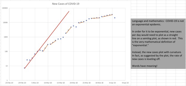
Slide One is New Infections plotted on a semi-logarithmic graph. Miguel’s commentary is in the shaded area to the right.
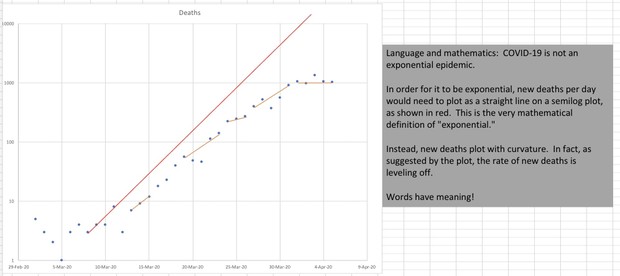
Slide Two is New Fatalities, also plotted on a semi-log graph. Miguel’s commentary is again in the shaded area to the right.
Summary: The Infections and Fatalities curves were never really “exponential,” a term used lately to promote fear in the populace. Also of note, the “bend to the right” on both charts was already occurring before the mitigation, social distancing, or outright lockdowns actually got going. Correlation is not causation, but it does cause some questions.
That is about as far as my meager skills can take this analysis. As to the accuracy of the charts and the interpretation, I will stand by the fact that the one guy who produced them and the other two who checked his work are industry leaders in this type of numerical analysis. I would bet my life on their assessments. In one instance I actually have.
Here’s the question they have solidified in my mind…Was this really a threat dangerous enough that we needed to destroy our economy…putting millions into penury, in order to stop it?
Please feel free to comment, with the understanding that I am unlikely to be able to answer substantive questions about how this works. There’s a very good reason each of the guys who helped with this make more money in 5 minutes than I do in a month.


Join the conversation as a VIP Member