

President Donald Trump speaks about the coronavirus in the James Brady Press Briefing Room of the White House, Monday, April 6, 2020, in Washington. (AP Photo/Alex Brandon)
This is the 20th in a series of nightly updates regarding Wuhan virus numbers in these United States. As of 2359Z, the below charts reflect current U.S. Wuhan virus numbers.
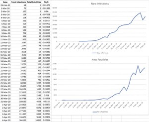
Chart One’s data table shows Total Infections, Total Fatalities, and the Mortality Rate. The upper graph shows the number of NEW infections by date. Hopefully, this will give us a clear view of the infection trend line as more test materials make it into the field and into common use. Today’s number of new infections is 29,439, which is 4,123 more than yesterday. The curve in new infections is still flattening.
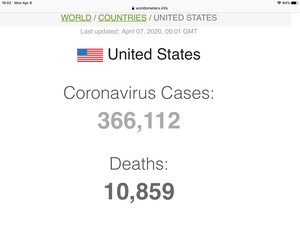
The lower graph shows new U.S. Fatalities. Today, we added 1,243 to the total count of American deaths, raising the total to 10,859. This was 78 more than yesterday. Again, however, the overall curve is still moving towards horizontal. Hopefully, with a few more days, it heads downward.
The second chart shows the U.S. Wuhan Virus Mortality rate. The Mortality Rate (M/R) (calculated by dividing the number of reported U.S. Infections into the number of reported U.S Fatalities) went back up over 2% today ending at 2.97%.
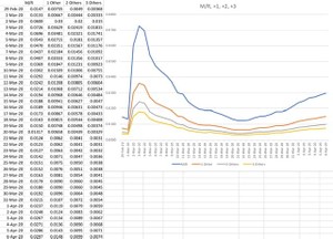
This chart also contains a “What If” graphic. It represents the M/R for reported infections. It also shows the M/R if we assume for each reported case of Wuhan Virus, there are 1, 2 or 3 other persons out there with it. For today’s report:
M/R = 2.97%
+1 = 1.48%
+2 = 0.99%
+3 = 0.74%
Analysis: At this point in time, we have a number of moving parts. The first part is “new infections” & “total infections.” As I noted in the very beginning, these numbers would radically increase as more test materials made it into the field and actual use.
This has happened and the Mortality Rate dropped precipitously as the “numerator” in the Fatalities/Infections ratio got bigger. However, as I noted earlier, because this disease has about a 14-day cycle give or take, fatalities will be a lagging number. They would be expected to rise 14 days after a spike in New Infections, thus raising the M/R. The M/R, will also lag behind New Infections, once that number peaks and begins to decline…also on a 14-day delay. We are definitely seeing this happen. Although the New Fatalities line appears to be flattening somewhat, the New Infections curve is more pronounced…moving towards horizontal/downward. This is driving an apparent increase in Mortality Rate.
Note: As I got deeper into this, I realized that I should go find some folks smarter than me to help out. I recruited three guys who do this kind of thing in their sleep. They are the leaders in their field in an industry that lives or dies by their analysis. They’ve helped me produce interesting conclusions that I’ll publish as an OPED on Wednesday morning. Stay tuned…For some of my readers, this will likely be old news…to me, it was somewhat of an eye-opener.
The Red State Team hopes this is of some value. Whether it is or isn’t, please let me know in the comments. Please comment on the value of the “New Infections” chart. Please understand, that although I’d like to include many more charts, time constraints make this impractical. If there is a current chart that would be better replaced by another type, please holler.
Prayers for all the folks on the front lines of this effort who are putting themselves at risk on our behalf.
Below is the screenshot of the Worldometers site, showing the “as of” timestamp for the data in this post.


Join the conversation as a VIP Member