One of the challenges facing public health bureaucrats and elected officials in the distribution of the Wuhan virus vaccine is ensuring it is done in a way that maximizes benefit and, hopefully, reduces the direct and indirect damage done by both the pandemic and the accompanying panic porn. That should be a fairly straightforward affair. If you vaccinated the most vulnerable first, and by most vulnerable, I mean those persons who are statistically most likely to have a severe or fatal reaction to the virus, you would reduce the death toll, and you would reduce the load on that healthcare system. That would allow the nation to get back to normal as the 99.97 or so percent of the population who will have none-to-manageable symptoms from infection await their turn, assuming they think the risk from the virus is greater than the risk from the vaccine.
Unfortunately, the decision-making process has become infected with critical race theory nonsense that seeks “equity” of outcomes based on income, age, and race. As we saw from the CDC’s proposed distribution matrix, a 20-year-old Black grocery store clerk would rank in front of a 70-year-old Black person because the oldster has fewer years left to live (never mind that the 20-year-old is not in any danger of death or debilitating condition) and as a BIPOC (Black, Indigenous and people of color) he would rank ahead of any white person based on racial equity. READ: CDC Is Literally Trying to Kill Granny by Using Critical Race Theory to Decide Who Will Get Wuhan Virus Vaccine. In fact, the category of “essential workers” was expanded by CDC not only to embrace frontline healthcare workers–more on that in a second–but such occupations as cab drivers and store clerks with the stated purpose of increasing the number of minorities eligible to receive the vaccine early.
Yesterday, I posted on the lack of logic in giving preference to healthcare workers because a) they’ve already worked 9 months in close proximity to the virus, b) most are statistically unlikely to suffer any but mild symptoms and c) the preference is only for a few weeks and the odds of more healthcare workers becoming sick during that period than have already recovered are nonexistent.
As more jurisdictions release their plans for vaccine distribution, we are beginning to see some troubling trends. In New York City, Bill de Blasio’s regime is ignoring the Orthodox Jewish communities he scapegoated for the spread of the virus in that city. None of the “hardest hit” neighborhoods first in line to receive the vaccination hold the Jewish communities that de Blasio publicly shamed for their failure to go along with his lockdown orders (READ Fraud or Malice? NYC’s De Blasio Refuses to Give Vaccine Priority to the Jewish Communities He Blamed for Spreading the Virus.} This poses the interesting dichotomy of whether de Blasio was lying about the Orthodox being the source of the spread of the virus or if he’s using his power to allocate the vaccine to punish them for their refusal to cooperate with him.
A more interesting case is evolving in Chicago. This is the distribution of the vaccine thus far:
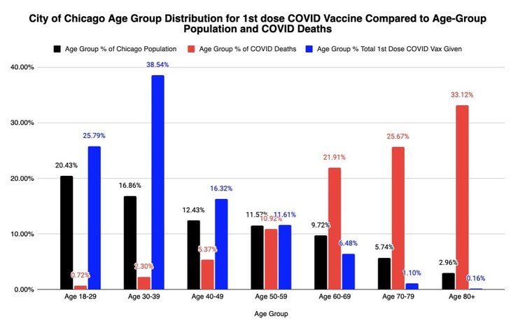
This image is provided by Twitter user Emma Woodhouse (@EWoodhouse7):
I caught an error in this graph I tweeted yesterday. I accidentally had the same % of COVID deaths for the two oldest age groups.
Corrected graph below, with today’s updated vax & death numbers. https://t.co/uodoFvoWg2 pic.twitter.com/krxoEBrRch
— Emma Woodhouse 😁 (@EWoodhouse7) December 27, 2020
If you look at the tabular data, you’ll see just 22 doses of vaccine have been administered to those 85 and over.
Just to show this is the starkest terms possible, see the raw numbers for age group recipients of the Covid vaccine in Chicago. Only 1.1% of all doses have been given to folks 70+
22 residents age 80+
Don’t want to potentially save too many ppl before 12/31, do we? https://t.co/eSNZTglKvF pic.twitter.com/pAPhxEWmwo
— Emma Woodhouse 😁 (@EWoodhouse7) December 27, 2020
For those asking, “well, does Chicago have more than 22 residents age 85 and older?” Well, you come here for answers, and answers are what you get. This is the most recent demographic breakout of Chicago by age and race.
Both charts show the ethnic composition of Chicago by age cohorts. The one on the right shows how each cohort is represented in Chicago.
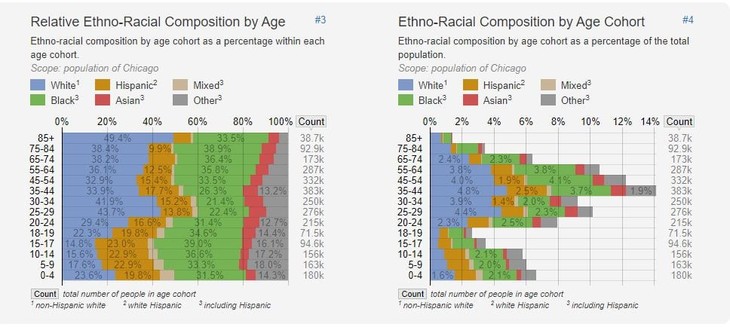
Age and Racial Demographics in Chicago via StatisticalAtlas.com
The current distribution shows that the population groups most likely to suffer serious effects from the Wuhan virus are the least likely to be offered the vaccine. The population groups most likely to get the vaccine are those who need it least. The one-fifth of the city that is most at risk, that is, those aged 60+, got about 7% of the doses given out thus far. In fact, the vaccine distribution is just about the opposite of what you’d want if you objective was to reduce deaths and the load on the healthcare system. (The abbreviation LTCF is for “long term care facility.)
Another view. Stacked age-group comparisons of Chicago Resident COVID19 Vaccinations, Hospitalizations, & Deaths.
LTCF staff & residents vaccinations were scheduled to begin today, 10 days after healthcare workers, even tho deaths in LTCF comprise ~50%+ of the COVID deaths total pic.twitter.com/PmL8JHpPf3
— Emma Woodhouse 😁 (@EWoodhouse7) December 28, 2020
Nothing here makes any sense, and Chicago, being what it is, no one will have the least bit of curiosity about how this came to be.




Join the conversation as a VIP Member