
Our friends at Peak Oil site TheOilDrum.com have an interesting year-end feature: The Chart of the Year. Lots of interesting graphs — have a look.
Three of my personal favorites are found below the fold, with minimal commentary from your humble correspondent.
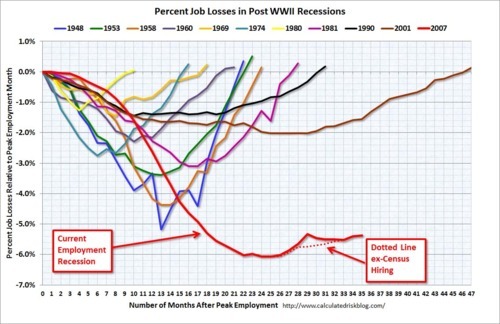
Having exhumed and drug the remains of John Maynard Keynes through the streets for the last couple of years … How’s Keynesian economic theory working out for you?
This graph shows the Energy Information Agency’s outlook for world oil production. We’d better get busy looking for those new supplies (light blue) if we are to offset natural decline in existing fields.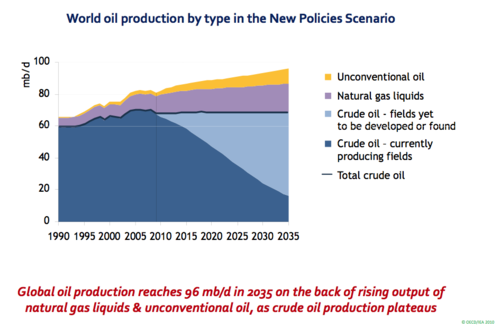
We’ve heard a lot about the Bakken Shale, the big new discovery in North Dakota that is driving a drilling boom up there. To put this boom in perspective, however, let’s remember that we’ve got to find another Bakken to replace the 350,000 erosion of Gulf of Mexico production since the Obama/Salazar moratorium kicked in.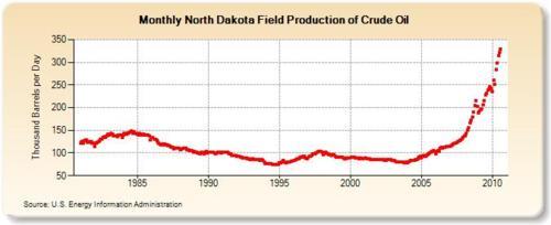
Discuss, and enjoy.
Cross-posted at VladEnBlog.


Join the conversation as a VIP Member