Since not long after the pandemic started, I’ve been doing my nerd thing, tracking the daily COVID stats for Missouri, the US, and several other states. I realize that there is plenty reason to retain a healthy dose of skepticism regarding the numbers as reported from various sources. I’ve never put much faith in the numbers themselves, but rather been tracking them consistently with an eye toward overall trends. Mostly because, as noted above, I’m a nerd. I also expect there’s a psychological explanation — like, it gives my control-freak brain a sense of some degree of “control” regarding something over which I obviously have very little.
In any event, it’s one of the things I do. The two primary sources I’ve monitored are the Johns Hopkins Coronavirus Map and Worldometers — the former primarily for the world and US totals, the latter for the US and individual states. Though both provide similar information, I like to eyeball things from two separate sources. (Their reported numbers are generally close, though not identical.)
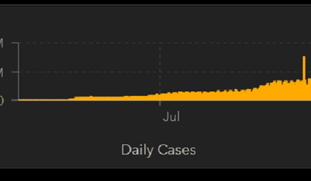
So, what does one do with all this data? Make charts and graphs, of course. The Johns Hopkins Coronavirus Map page includes not just a map of the world and the cumulative totals and hotspots (which essentially includes the entire globe except northern Canada, Greenland, and Siberia at this point) and tables of the running tallies, but also a chart of the daily case totals. A funny thing happened to that chart (and the data on which it was based) around December 10th — there was a HUGE one-day jump in daily case totals. In recent months, the worldwide daily (new) case total has ranged from roughly 400,000 to 800,000, representing a roughly .5% to 1% increase. However, on December 10, the daily case total was 1,594,447 — a 2.3% increase.
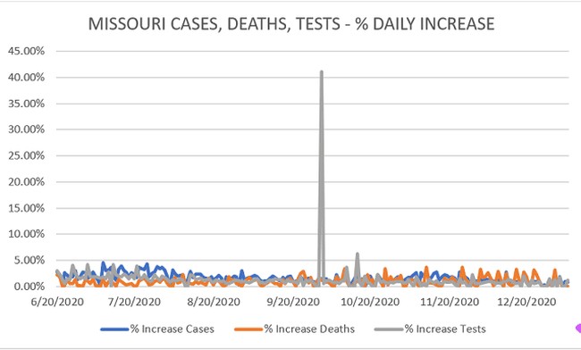
I haven’t seen an explanation for this, but I have noticed over the months that I have been monitoring the numbers that we’ll see an occasional data dump, most often in testing numbers, but sometimes in reported case numbers. So, for instance, as I’ve written previously, Missouri saw a huge jump in its testing numbers on October 1st. The result of which was a linear chart tracking daily case, death, and testing totals showing a notable spike:
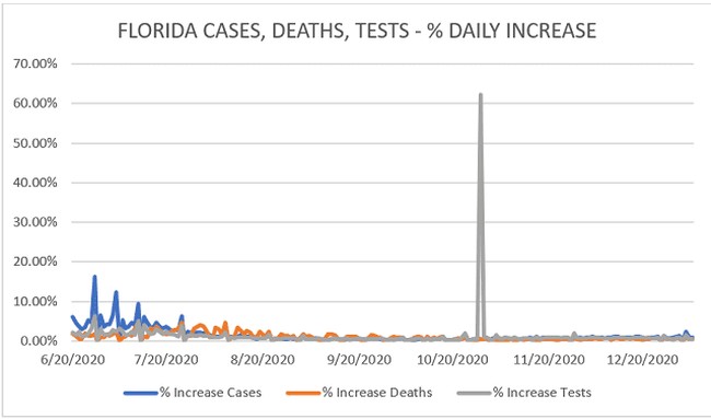
Florida saw a similar spike in late October, reporting a one-day add of 3,752,363 tests — a 62.3% jump!
Here’s what that looks like on the linear chart:
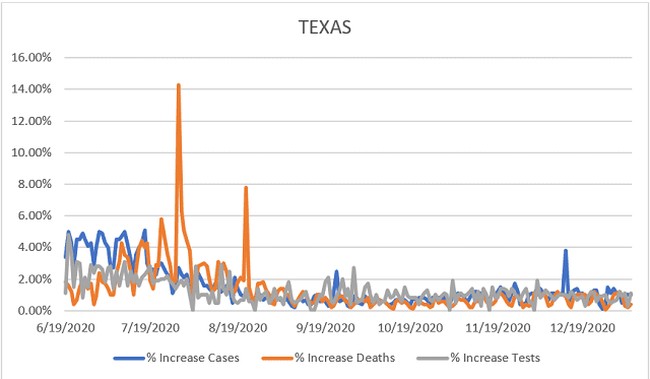
And earlier last summer, Texas saw an unfortunately large jump in daily reported deaths both in July and August.
The Johns Hopkins daily new cases chart is a clustered column graph, rather than linear. That means that the December 10 jump generated a singular bar towering above its compadres. Which, it just so happens, looks rather like the chart is flipping its viewers the bird.
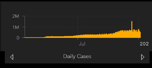
Daily Cases via Johns Hopkins Coronavirus Resource Center
Seems like an apt metaphor, no?
Now, do I think the world TRULY is attempting to send humankind a message via this chart? No. Though I do have to admit — there are days when I sort of wouldn’t blame it.
Hopefully, we’ll soon see that chart as more of a frown. With just an odd blip in the middle of it.


Join the conversation as a VIP Member