

Dr. Deborah Birx, White House coronavirus response coordinator, speaks during a coronavirus task force briefing at the White House, Saturday, April 4, 2020, in Washington. (AP Photo/Patrick Semansky)
There appear to be more and more questions regarding the determination and tabulation of U.S. fatalities attributed to the Wuhan Virus. Over the past couple of weeks, reporting on each day’s numbers and plotting them on simple graphs, I have come up with some interesting conclusions. The site I use to collect the base data every day is the Worldometers site, United States Page
I use this page every day. I check its “closing numbers” between 2359-0010Z, for consistency. The reason for the “spread” is that the “as of time” doesn’t advance minute by minute, but rather as they input new data.
One of the most useful parts of the page is the Data Table. The data can be sorted by column, from most to least and from least to most, a handy feature. More on this further down.
During the last week, as each day passed, I was getting a sense of cautious optimism. This was mostly driven by the New Fatalities curve bending (albeit in fits and starts) towards the right. Then for (now) 5 days running, the number of new deaths each day has increased. Something started to smell funny.
Here is where the flexibility of the Worldometers site was helpful. As of 22:47Z, here is the table I used.
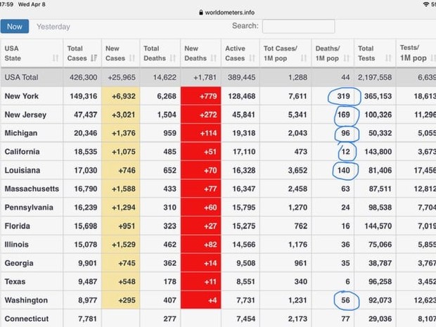
As you can see, the New York Fatalities per million citizens is well over twice that of its nearest other states. Some folks might try to brush that aside by saying that New York is “ahead” of other locales in this process. I would point them to New Jersey, Louisiana, and Michigan which are along the same infection path, yet whose fatalities are not following New York.
New Jersey, Louisiana, and Michigan have infections that began more or less at the same time as New York, yet whose Fatalities per Million inhabitants, are less than half. “That’s fine. Ford,” some may state. “What about all the other states that started earlier?”
Perfect. Let’s look at Washington State and California, both of which were essentially “ground zero” for this mess. Washington has a rate of 56 fatalities per million, while California has a rate of 12….that’s TWELVE per million…compared to New York, which clocks in at 319 per million as of 22:47Z April 8, 2020.
How do I see this? Simple. I point to COL/Dr. Birx’s comments, whereby she boldly stated on April 7, 2020, that if there was Wuhan Virus present in a fatality, then that death would be attributed to the China Virus. So, given that, one must ask the single most important question, “Cui Bono?” (Who benefits?)
That answer is quite simple. Let’s look at the fountain of federal funding that will flow towards the states and certain localities. If a person dies of a heart attack, diabetic coma or any other long term malady, there would, of course, be little if any federal dollars attached to that event. Write “Coronavirus” on the death certificate, and everything changes. Federal agencies get more funding. States and cities get more federal dollars.
As these folks doctor the numbers, millions of Americans are being irreparably damaged. It’s time we started using real numbers. It’s time we started making decisions based on facts rather than emotions.


Join the conversation as a VIP Member