
A picture is worth 1,000 words. Or 95 quadrillion BTUs, which is how much energy from all sources the U.S. consumed in 2009.
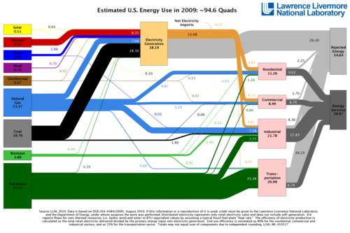
A well-constructed graph can convey so much information. I posted a link to this image on RedHot the other night, but thought it was worth bringing out a few observations.
Since energy flow is represented by the width of the various lines, you may wish to view the original image size here. You’ll need it in order to appreciate the relative contributions of wind and solar.
Observations:
- We have truly huge, energy-based economy. It doesn’t turn on a dime.
- The U.S. consumes 25% of the world’s petroleum, and produces, not coincidentally, 25% of global GDP.
- As much as we hear about “renewable energy”, the dominant renewable source is hydropower. The greens want less hydropower, not more.
- Solar is coded yellow in this graphic. Wind is in purple. They are only used to generate electricity. The primary sources of electricity are coal, natural gas and nuclear energy. Wind and solar would have to grow explosively for many years to become a significant source of electricity.
- Natural gas is the most versatile fuel on the chart. It is a major source of all energy except transportation, and it has growth potential in that market. We have an ample supply of gas, which is clean, efficient and nearly 100% domestic.
What do you see that I missed?
Cross-posted at VladEnBlog.
